
Croissanji




The Brief
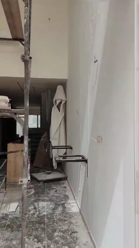
The client didn't start from zero. He bought an existing space — a beer and chicken diner — with a completely different identity from what Croissanji needed to be. The brief was clear: limited budget, keep whatever can be kept, and transform the space into a warm Croissanji branch built for breakfast through dinner.
The space was a challenge before anything else. Long and rectangular — generous in length, narrow in depth — with a ceiling that varied dramatically: six metres on one side, three on the other.
What We Kept
The existing metal grid ceiling structure stayed. We repainted it burgundy and suspended the lighting from it, turning a leftover element into the defining feature of the room. The bench seating stayed too — reupholstered in brand colours. Tables were cut and repositioned to fit the new layout. Nothing was thrown away that didn't need to be.
The Counter
An L-shaped counter holds everything the operation needs: two display fridges, cashier station, preparation area, oven, and coffee machine — all inside, invisible to the client. The circulation zone between counter and seating was maintained at a minimum of one metre throughout. Two people can pass while someone stands at the counter. The space never feels blocked.
The Seating Strategy
A narrow space with one seating type becomes a trap. We designed for everyone who walks in.
The solo visitor gets bar seating along the window — facing the street, no awkward table for one. The couple gets floating wall tables with bar chairs, compact and facing the counter. Families have a dedicated area in the back. The existing bench seating, reupholstered, anchors the middle of the room.
Every person who walks in finds their place without thinking about it.
Light & Height
The six-metre ceiling on one side and the three-metre on the other created imbalance. We lined all the walls with LED lighting — not to decorate, but to draw the eye upward and outward, giving the narrow space a sense of expansion. The metal ceiling structure, painted brand red, carries the lights and becomes the ceiling detail at the same time.
Colour & Texture
The palette is the brand: burgundy as the anchor, warm beige walls, layered textures that add depth without crowding. Some walls carry texture. Others carry signage or graphic detail. Every surface has something to say — just not all at the same volume.
The design was built for dwell time. A space that feels warm makes people stay. People who stay order more. Croissanji Dekwaneh became a place people return to — not just for the food, but because the space feels like it was made for them.
3D visualization
Execution drawings
Execution follow-up